We're Kevin Kyburz and Daniel Müller, we both contribute to EmDash as maintainers, and this is where we write down what we learn, in English and in German. What EmDash is and who it's worth switching for is in Kevin's guide for agencies.
With the release of EmDash 1.0, it was time for this blog. To kick things off, we'll show you how a standard template turned into a site with a face of its own. Much of it works the same in any EmDash project, from the schema and covers to caching and two languages.
It all started with the name.
The name is the concept
"The Weekly Dash" already says everything the site needs. So we took the name literally instead of decorating around it:
- Weekly means issues. The site is organized by calendar week.
- Dash means the dash. It's the only graphic motif.
That's the whole concept, and everything else follows from those two rules. Let's start with the week.
Weekly: one issue per week
An issue, for us, is everything that comes out in one calendar week. A bar at the top names the current issue, for example "Issue week 40 / 2026". Below it, the home page groups posts by week. Each week opens with its number set large, next to the date range and the number of posts. The archive and section pages use the same grid.
There's not much code behind it. Weeks are ISO 8601 weeks, the numbering most of Europe uses, computed in the site's time zone (Berlin). So a post published late on a Sunday stays in its week instead of sliding into the next one just because a server counts in UTC.
The newest post leads the home page as a full-width block in its section's color, with a large headline and the section's mark, or the version number for a changelog. Next to the list sits a column with the latest changelog, the authors and an RSS box, which stays in view as you scroll.
The week gives the site its order; the look comes from the other half of the name.
Dash: one mark, nothing else
The wordmark ends in a dash with a gradient from orange #ff5a1f to yellow #ffd200. It sits on the baseline at roughly the weight of the letters' stems, so it reads as part of the type rather than a logo stuck next to it.
That version won a round of its own, beating a dash at em-dash height, a double underline, a frame and a marker under "Dash".
Otherwise the dash only shows up where it marks something: as the end mark after every article, on the 404 page and as the marker under links. A faint raster of staggered dashes textures the color blocks and the dark footer, while the page background stays plain.
To keep it that way, the rule is in our contributor docs. The gradient belongs to the dash, so there are no gradient fills and no states that suddenly turn into a gradient.
A single motif only works if everything around it stays quiet, and getting there took two design rounds.
From newspaper to tech magazine
The first round had serif headlines on a paper tone and read like a newspaper. The second kept the structure and gave it the voice of a tech magazine.
Surfaces are now white and near-black, with a dark header and footer in both color schemes. No shadows, no glass, no rounded corners; 1px and 4px rules structure the page.
We go easy on color. There's one signal color, Kevin's brand yellow #ffd200, and one fill per section. Text on a color fill is always dark, at a contrast of at least 7:1. The fills don't change with the color scheme, so that holds in dark mode too.
Every section aligns to a single 1240px container, and the article text column stays at 680px.
Which sections carry those colors is something we reworked just before launch.
Four sections, sorted by what you're after
At first the sections were cut by subject: Guides, Changelog, Plugins. Nearly every post ended up in Guides, including the agency guide, which is really an analysis. And plugins are a subject, not a kind of article.
Now the sections follow what you're trying to do, loosely modeled on Diátaxis:
- Getting started in mint
#4fe3b8: you're new to EmDash and want to understand it and get going. - Guides in yellow
#ffd200: your site runs and you want to get one specific task done. - Background in pink
#ff8fc8: you want to understand or assess something, with analysis, tests and looks behind the scenes like this one. - Changelog in violet
#9d8cff: what's new in a release, and what you need to do about it.
The line between Getting started and Guides is simple. If you need a running EmDash site to follow along, it's a guide. What a post is about, whether Plugins, Astro, Cloudflare, Performance or WordPress, goes into topics, and a post can have several. Old links to the Plugins section land on the Plugins topic.
Mint changed hands in the process. It used to belong to Plugins, and green reads as "let's go" anyway. Background got pink because a blue between mint and violet would have sat too close to both. Pink also stays well clear of the dash's orange.
Each section also has a mark for the lead and for covers without a cover line: » for Getting started, an em dash for Guides, ¶ for Background, and for Changelog the version number, or a Δ when the title has none.
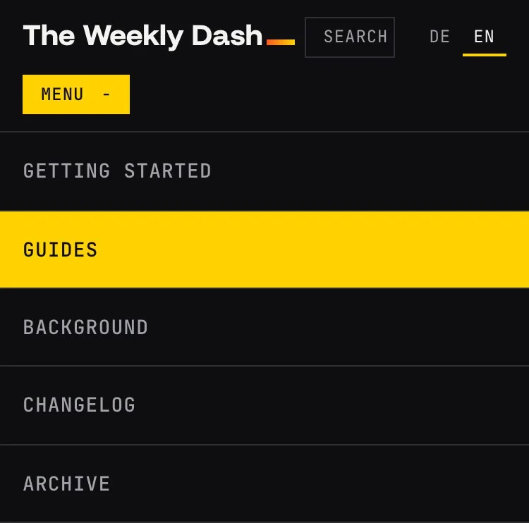
The header lists the four sections and the archive. Below 1000px wide, the five items no longer fit next to the wordmark, search and language switch, so a Menu button opens them as a list over the page.
That leaves the type, which has to bring some character with this little decoration.
The typeface: Funnel Display
Headlines, the wordmark and all week and version numbers are set in Funnel Display. Its square cuts look like serifs drawn in pixels, and its square period keeps version numbers like 1.0.1 clean.
We picked it because it looks modern and creative. That suits EmDash itself, a new CMS built from scratch for today's web stack rather than a legacy system carried forward.
Interface and body text are set in its sibling, Funnel Sans, while labels, dates, navigation and code use JetBrains Mono.
All three are variable fonts, self-hosted through Astro's fonts API, and all three are preloaded: Funnel Display and Funnel Sans at about 18 KB each, JetBrains Mono at about 40 KB, since the navigation and labels at the top of every page use it.
Funnel Display does have one gap: it has no Greek at all. So the Δ on changelogs without a version number is set in JetBrains Mono, and browsers fetch that Greek font file (9 KB) only on pages that actually show a Δ.
Section colors and Funnel Display meet again right where other blogs would put a photo.
Covers without stock photos
A blog about a CMS has an image problem. There are no good photos of a database migration, and stock shots of laptops and coffee cups say nothing. So we skip them.
A post without a featured image gets a data sheet as its cover instead, on its section's color:
- Changelog shows the version number, set large in Funnel Display.
- Every other section shows a cover line as a terminal prompt, such as
› npm install emdash@lateston Kevin's post about updating EmDash.
It doesn't have to be a command. Kevin's agency guide, for example, carries › Where EmDash fits next to WordPress.
The cover line is its own optional schema field, cover_line, with up to three lines. Without one, the cover takes the first line of the post's first code block, and without that, the headline with the section's mark. Lines only break between words, so package names and commands stay whole.
One rule for the sample data: no made-up release numbers. In a changelog of all places, a cover showing a version that doesn't exist would simply be wrong.
A real image still works. If a post has a featured image, it replaces the data sheet.
For shared links, the Worker renders the same composition as a 1200 × 630 PNG with Satori and resvg, and the edge cache keeps it from then on. Unlike the cover, that image always carries the headline, since it has to stand on its own in a feed.
That cover_line is a schema field and not code takes us straight under the hood.
Under the hood: EmDash on Cloudflare
The site runs on EmDash itself, starting from the blog-cloudflare template. It's hosted on Cloudflare Workers, with content in D1 and media in R2, both in the Western Europe region.
In EmDash the schema lives in the database, so cover_line is a text field, not code. We defined it in the seed before the production database existed, and the first import carried it over. Since then we change the schema in the admin under Content Types, and the seed file just follows along so new local databases get the same schema.
Public pages are served from Cloudflare's edge cache: fresh for five minutes, then stale-while-revalidate for a day. The same goes for the RSS feeds and share images. When we publish a post or tweak navigation or settings, EmDash purges the affected pages through cache tags. Anything rendered for a signed-in user never enters the cache, because the comment form carries their name and email. Editors still get an Edit button on cached pages, which opens a fresh copy.
Every branch gets its own Worker Preview, which only members of our Cloudflare account can open, through Cloudflare Access. Previews bind a D1 database of their own, a copy of production, plus their own R2 bucket and KV namespace, so nothing in a preview touches production. Changes reach main through pull requests, and every merge goes live right away.
We wrote three small site plugins ourselves. One replaces EmDash's JSON-LD with a single linked schema.org graph per page, one emails us when a comment is waiting for approval, and the third guards our URLs; more on that in a moment. We can now also install plugins from the EmDash registry. They run sandboxed, each in a Worker of its own, and can only do what we approved at install time. Kevin tried out what that sandbox really blocks in his plugin sandbox post.
Visitor numbers come from Cloudflare Web Analytics, which uses no cookies. Alongside it runs the Analytics plugin by danielmlr from the registry, which is Daniel's own. Turnstile, the spam protection on the comment form, only loads once you click into the form. The one cookie we set ourselves is for when you explicitly pick "Light" or "Dark" in the footer. That's why the RSS box says "No tracking cookies" rather than just "No tracking".
That leaves the second language.
Two languages, one site
German is the default language and gets no prefix; English lives under /en/. The reason is practical: give the default locale a prefix and the EmDash admin breaks.
Posts and pages sit right at the root, at /<slug> and /en/<slug>. Listings carry a word in the reader's language: /en/archive, /en/section/…, /en/topic/… and /en/author/… in English, /archiv, /rubrik/…, /thema/… and /autor/… in German. Old URLs redirect permanently. Since posts, pages and routes now share one namespace, our third plugin refuses to publish anything whose slug a route already uses or the other collection already has.
Every page has a DE/EN switch that takes you to that page's own translation, plus hreflang links. Sections get their own English slugs (anleitungen becomes guides) and keep their color. Search, the RSS feed, date formats and week numbers follow the language.
Every post appears in both languages, and both editions go live together. Whoever wrote a post also adapts it into English, for an international audience rather than word for word.
Last, a quick check that the site stayed clean through all of this.
What Lighthouse says
Before launch we ran Lighthouse on a local production build, measured on mobile. The German and English home pages and an article page scored 100 each for accessibility, best practices and SEO. Cumulative Layout Shift was 0, web fonts included.
Bottom line
We set out to show how a template turns into a site with its own face. For the design, two rules hidden in the name were enough: weekly issues and a single dash as the motif. The four sections sort by what you're after, not by subject. The covers solve the image problem without stock photos, using one schema field and some CSS. And the parts you can reuse in your own project (caching, previews, two languages) come with EmDash and Cloudflare.
Everything we publish from now on goes into its week's issue. To follow along, subscribe to the RSS feed.


Comments
No comments yet
First-time comments appear once we've approved them. How we handle your details